By Katie Blake
previously published 4/30/14
Workplace Information Needs: Color Perception and Color Blindness Tools for Worksheets
 In the everyday of work I am asked to do many things which involve some form of information interpretation. I started tracking reference questions just to be able to reflect upon the information needs which are the most common in my current office. I am doing this because one of my tasks is to convert a legacy paper filing system to digital. To be efficient technologically, but with the particular users’ habits in mind, it will be far more productive to recognize how information is built, accessed and used. I should mention that I currently work in a real estate property company not a library so even though I aid in the search for books and articles, more often I have to find ways to solve problems stemming from software compatibility or versioning such as taking a PDF of a 1970s document and converting it to Word 2013 matching as closely as possible its tables and graphics. Investigating Color Perception: a beginning What started my investigation into color perception in the workplace was an Excel workbook which had been emailed to my boss. He wanted me to print out each of the worksheets but had particular desires on how to print them. This is a familiar request in the office place and like a reference interview, one of the parameters should be finding out whether the prints should be done in black & white or in color. My boss wanted me to verbally identify for him how many colors there were on each of the pages, because he was color blind. In this case the author of the document had used several pastel colors to differentiate sums. The choices used were the same saturation level, made worse by the fact that they were red and green, which rendered them indistinguishable from one another for my boss. After realizing how few options there were in common office tools I decided to read further into color blindness as well as look for software that could help make information interpretation easier for him. On Color Blindness Turns out that one in twelve men, or 8% of the population of men and about 0.5% of women in the world have some variation of color blindness. There are several kinds of color perception deficiencies, Deuternopia, Protanopia, Tritanopia and Achromatopsia. Red-green vision (Deuternopia) is the most common according to the American Academy of Opthalmology, turning reds and greens into corresponding shades of yellow. The least common form is Achromatopsia which is when a person sees entirely in black and white. For the rest of us, the numbers of colors we can distinguish range between one hundred thousand and ten million. There are many sites and forums which discuss the problems people face when they have one version or another of color blindness. Frustrations when dealing with text or backgrounds in red or green are the most problematic if the creators have used those colors at the same saturation level. One site I read noted that product packaging made mostly with blue stood out in the grocery aisle when the greens and red that are so striking to the rest of us have been rendered various shades of yellow to the Deuternopic person. Back to the Original Worksheet I wanted to re-examine the original worksheets that were causing my boss problems so I downloaded the free software called, ColorOracle (by Berhard Jenny and Nathaniel Vaughn Kelso) it is one of many filters available which allows us to see how somebody with color perception issues would view the same thing on a computer screen. Not surprisingly, ColorOracle showed me that the worksheet having employed the lightest of the reds and greens, offered no way to tell the difference between those colors. With the amount of people who have CVD numbering in the millions, when you are presenting any kind of visualized information, such as handouts, consider some alternatives to your design choices:
- Make judicious use of bold, italics, font size
- Fill with a background pattern instead of color
- Change or use borders to indicate importance
- Try to avoid Red and Green
- If you need to use red and green, consciously choose distinctly different saturation levels
Designer Alex Bulat’s suggestions add on these:
- Do not use colors to convey important information
- Increase contrast between similar colors
- Lighten light colors and darken the dark ones
- Increase saturation of colors
- Use patterns, symbols and strokes
The best computer tools I have found for computer-using folks with CVD are those which identify the color,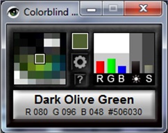 per pixel, that the mouse is pointed to. There are several options but I tested the free ones and liked best Colorblind Assistant. Here is how those tools looks on your desktop when it is opened. Small, and easy to move to an unobtrusive place. It enlarges the area where your mouse is and by pixel shows you the color under examination, identifying it by name. So I now know that color in the Word clipboard brush is “burlywood” not to be confused with the different shade of burlywood the clipboard’s Paste icon is! For me, the problem remains that as documents come into our office I need to find ways to help my boss interpret once printed. That essentially means I need to be hands-on with the fixing because to date, there is no software which follow filters all the way through to printing. What I was hoping to find was software that would allow me to pass anything through a filter specific to the type of color blindness my boss has and adjust saturation levels enough to be identifiable before printing. Or at least something that would trigger a recommendation for adjustment. Then I could manually determine whether time permitted adjustment before printing. Problems with New Versions I emailed with creator of Colorblind Assistant (Achronism Studios) Ryan Mallen who suggests that the reason for this has to do with things like the near annual new versions of Windows, Adobe, etc and that the CVD needs include not just fixed items like documents but also websites which are “complex things to interpret from a programming point of view,” and that “From a programming point of view, replacing colours in an image is quite simple and achievable to program, it’s the conversion of file formats and keeping the program up-to-date that is the real difficulty.” He suggests this workaround: “My advice would be to convert your documents into picture format (find software that converts PDF, Word and Excel to .JPG) and then use software that has a colour replace tool (photoshop has an option called Select->color range), adjust the hue of that color range to something of your liking, then use software to convert it back to PDF or Word for printing.” Microsoft Accessibility Guide
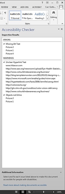
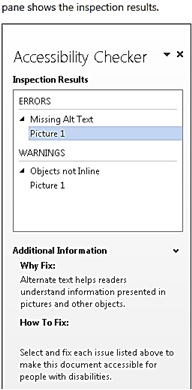 I want to also suggest that utilizing the Microsoft Accessibility Guide which is supposed to identify “areas that might be challenging for users with disabilities to view or use, and providing a task pane to review those areas, users can fix potential problems with their content before finalizing.” By only note is that when I tested this with my problem Excel worksheet, it was not identifying cells that had potential color saturation issues nor even calling attention to size of text or otherwise. When I used the same check on a Word document I was creating for this article which contained notes, hyperlinks etc, the inspection results noted things such as Infrequent Headings; Unclear Hyperlink Text; and then a list of places where ‘headers’ were “Too Long”. I failed to see how some of these interfere with visual impairment, but was given a helpful hint below the pane: “Why Fix: Short, concise headings make it easier for people with disabilities to quickly navigate the document structure.” Conclusion I conclude that in order to best serve the needs of CVD, as a document creator I need to be conscious of color, especially if I have leaned heavily on it to make my point. The readability of any visual object changes perceptions and directs attention depending upon the formatting and following design. This is something all Information Professionals should be sensitive to regardless of where they work. Further reading: http://hypertextbook.com/facts/2006/JenniferLeong.shtml http://ghr.nlm.nih.gov/condition/color-vision-deficiency Katie recently graduated with a masters in Art History from Pratt Institute. She is a Library and Information Science graduate from the University of Washington’s iSchool as well. She has worked in many states across the country for libraries, teaching, in the film industry, office job amazingness and was even once outfitted as Miffy for Nickelodeon during a Kid’s Choice party. Having just completed her thesis, Katie is currently living and making art in her hometown of Anchorage, Alaska.
2 comments for “Color Perception & Color Blindness Tools for Worksheets”